While I was at Porkus I used the font Comic Sans for most of my reports and forms because I liked the clean lines, appreciated that the font set was loaded on all our office PCs as part of the basic installation and wouldn't be transformed into the dreaded boxes, and because the name reinforced my developing belief that I just might be working for klowns. On the latter, I would have used a font called "Pearls Before Swine" to underscore the same point if it had been available.
I also thought comic sans looked cool and creative in that "I don't need to impress you with my archetypal coolness" sort of way. Belatedly, I found out that I am not cool, never was, and -- in the opinion of my children -- am not likely to be cool anytime in the future.
Another jolt is that there is a group of people who have deemed comic sans not only uncool but a basic insult to the fabric of the universe. The movement to ban comic sans started in 1999 and is said to be picking up adherents.
What's not to like about comic sans? The font was based on the hand lettering used by artists of classic comic books, so there's genuine geek cred. Unfortunately, it was developed for Microsoft Bob, widely regarded as the New Coke of user interfaces. The font's use spread and the detractors cite its jarring misuse in dire warning labels written in the whimsical style. It brings to mind the old Steve Martin routine where he demonstrates that no one can be dismal while playing the banjo.
Here's the Wikipedia's take on the font that many love to hate: http://en.wikipedia.org/wiki/Comic_Sans
And the site of the Ban Comic Sans group, complete with petition:
http://bancomicsans.com/main/
They must have infiltrated widely because I can't change this post to comic sans without HTML heavy lifting. Google "Comic sans must die" for more examples and chatter on this nearly meaningless but somehow both enduring and endearing kerfuffle.
skip to main |
skip to sidebar
This is my journey through job transition from a toxic environment to a better life. Join me for a few thoughts and a few laughs along the way.
What are "klowns in my koffee"? They are the factors large and small that make you less than you are. A "klown" can be a grossly incompetent boss,
a short-sighted policy or a moronic coworker. They won't kill you, at least not immediately, but they abrade the soul
as you scrape past them to get through the day. Sometimes it's best to dump them out of the cup.

Living la vida eclectica
I had some dreams ... they were klowns in my koffee.
(With apologies to Carly Simon)
This is my journey through job transition from a toxic environment to a better life. Join me for a few thoughts and a few laughs along the way.
What are "klowns in my koffee"? They are the factors large and small that make you less than you are. A "klown" can be a grossly incompetent boss,
a short-sighted policy or a moronic coworker. They won't kill you, at least not immediately, but they abrade the soul
as you scrape past them to get through the day. Sometimes it's best to dump them out of the cup.
Sunday
Subscribe to:
Post Comments (Atom)
Search This Blog
Me

- Burning Khrome
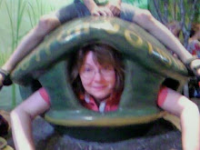
- I live in an anonymous suburb of an anonymous Midwestern city. I'm older than I feel but younger than my passport picture appears. I'm an INTJ -- and you know what a pain those people can be. I have two strong areas of skill -- sarcasm and nearly paralyzing self-analysis. Put them together like chocolate and peanut butter and you get this blog that sticks to your teeth. The best picture taken of me in the last five years was inside a turtle. I'm afraid to know what that means.
Most Read Posts
Categories
- Cooking (3)
- Kazakhstan (31)
- Porkus (25)
- Scouts (22)
- adoption (30)
- art (4)
- book review (3)
- cartoon (9)
- computer (3)
- concert (1)
- consumer (3)
- crafts (1)
- current events (11)
- dance (2)
- dining (3)
- family (19)
- food (3)
- frugal living (23)
- gardening (6)
- gender roles (2)
- green living (9)
- growth (8)
- health (11)
- holidays (34)
- home improvement (25)
- humor (30)
- jazz (2)
- job search (16)
- life (3)
- links (14)
- movies (1)
- music (17)
- odd jobs (4)
- parenting (34)
- photography (13)
- poetry (6)
- political (1)
- quality (5)
- recipe (2)
- school (5)
- science fiction (1)
- science/technology (5)
- shopping (2)
- social media (4)
- social responsibility (2)
- sports (11)
- travel (7)
- video (27)
- video games (1)
- weather (9)
- writing (13)
The Journey
-
▼
2010
(279)
-
▼
May
(31)
- Day 66 - Memorial Day
- Day 65 - Kazakhstan Part 3
- Day 64 - Kids' Day
- Day 63 - Komics
- Day 62 - Poetry Klass
- Day 61 - Kindergarten Screening
- Day 60 - Awkward ...
- Day 59 - Mucho Kalor
- Day 59 - Kazakhstan Part 2
- Day 58 - Scout Kamp
- Day 57 - De-Kluttering
- Day 56 - Porkus Kountdown
- Day 55 - Little League Klichés
- Day 54 - Kringing to Admit
- Day 53 - Katcher in the Wry?
- Day 52 - Kazakhstan Part 1
- Day 51 - Know Your Weeds
- Day 50 - Karma Chameleon
- Day 49 - Things to Kome?
- Day 48 - Kareer Resources
- Day 47 - Koncern
- Day 46 - LinkSync 2
- Day 45 - Happy Mother's Day
- Day 44 - Tying Knots
- Day 43 - Koming Klean
- Day 42 - Mother's Day Approaches
- Day 41 - Weed n' Feed? Indeed!
- Day 40 - Porkus Hears a Who
- Day 39 - Tears of a Klone
- Day 38 - Komic Sans Bans?
- Day 37 - LinkSync
-
▼
May
(31)
Friends Who Blog
Life and Lifestyle
Live Cheap
Burning Khrome. Powered by Blogger.
Copyright © Klowns in my Koffee | Blogger Theme by BloggerThemes


No comments:
Post a Comment